The direction, and why
A warm studio ground, frosted glass chrome, one teal accent, and the garment as the hero.
Why. She judges colour by eye, in rooms she already knows. So the screen is a studio: a warm floor so colour reads true, quiet glass, one colour for the actions she can take, the garment given the room.
The dress gets the screen
25%
of the width, at most, for rails and panels together.
One stage, one panel. The artefact gets 60% of the height in a 2:3 frame. The build sits at 28.7%, recorded.
Motion
Quick for feedback, slow for the stage, so nothing moves faster than her eye.
Colour, and why
Teal marks action and only action.
Why warm, not grey. A photo studio shoots on a warm, even floor so a garment's colour reads true. A cool grey screen would tint the fabric she is judging.
Why one accent. On a set, nothing competes with the garment. The one colour on screen that is not hers is teal, and it marks only the actions she can take.
Why a deep and a bright shade. Both are the same teal, like one light at two strengths: the deep shade carries words so they stay readable, the bright one lights small marks.
Type, and why
Aa Bb 123
Why Plus Jakarta for titles. A style name should read like the name on a lookbook page: heavy and tight, so it has presence without needing a colour.
Why Manrope for everything else. The controls are the crew, not the cast: plain, open letters that stay readable on frosted glass and never pull the eye from the garment.
Why only three sizes. A set feels calm when little competes for attention: title, control and label, and nothing in between.
Glass, and why
A warm tint, never pure white. The edge is lit from above: .72 top, .42 sides, .22 below.
Why frosted glass. Like the diffusers around a set, the panels soften what is behind them without hiding it. The controls sit lightly over the scene, and the garment stays in view.
Why tinted, not white. Pure white would read as milk and change the light on set. Tinted with the floor's warmth, the glass sits in the same light as the garment.
Why one material. Four thicknesses of the same glass, for bars, panels, sheets and pills, so the screen reads as one room, not a stack of boxes.
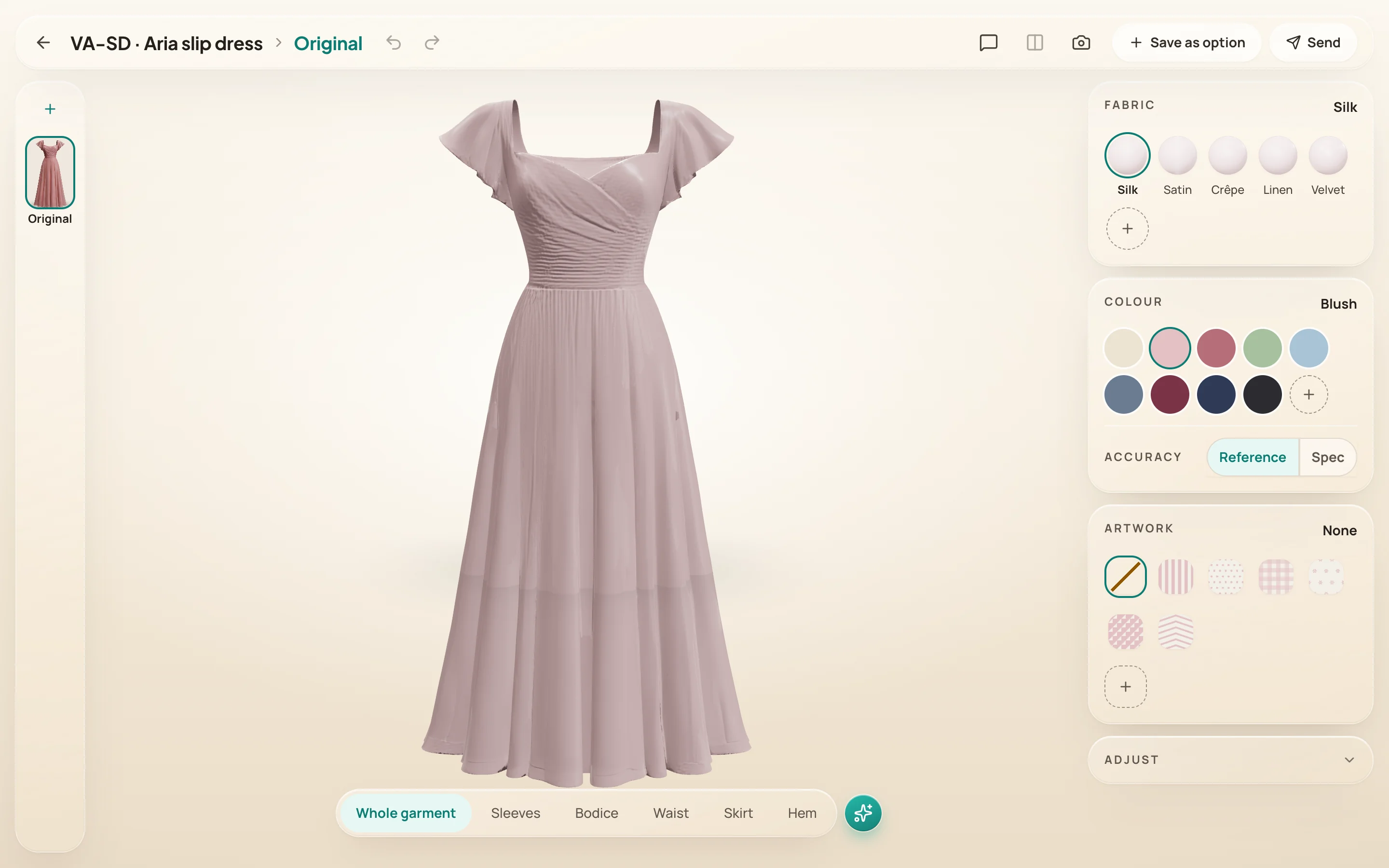
The whole screen is the scene
The canvas fills the window under floating glass. Turn the dress and it passes under the bar; a key light follows it.
Controls
Every action is 40px and a pill. Words sit on teal-700 only; tools are ink at rest, teal-50 when pressed.
Depth and shape
Shadow-led depth; a hard edge would box the garment in. Never pill a card or an input.
Selection
An outline, never a tint: a 2.5px teal stroke, a white halo, a soft glow. The colour chosen is the colour seen.
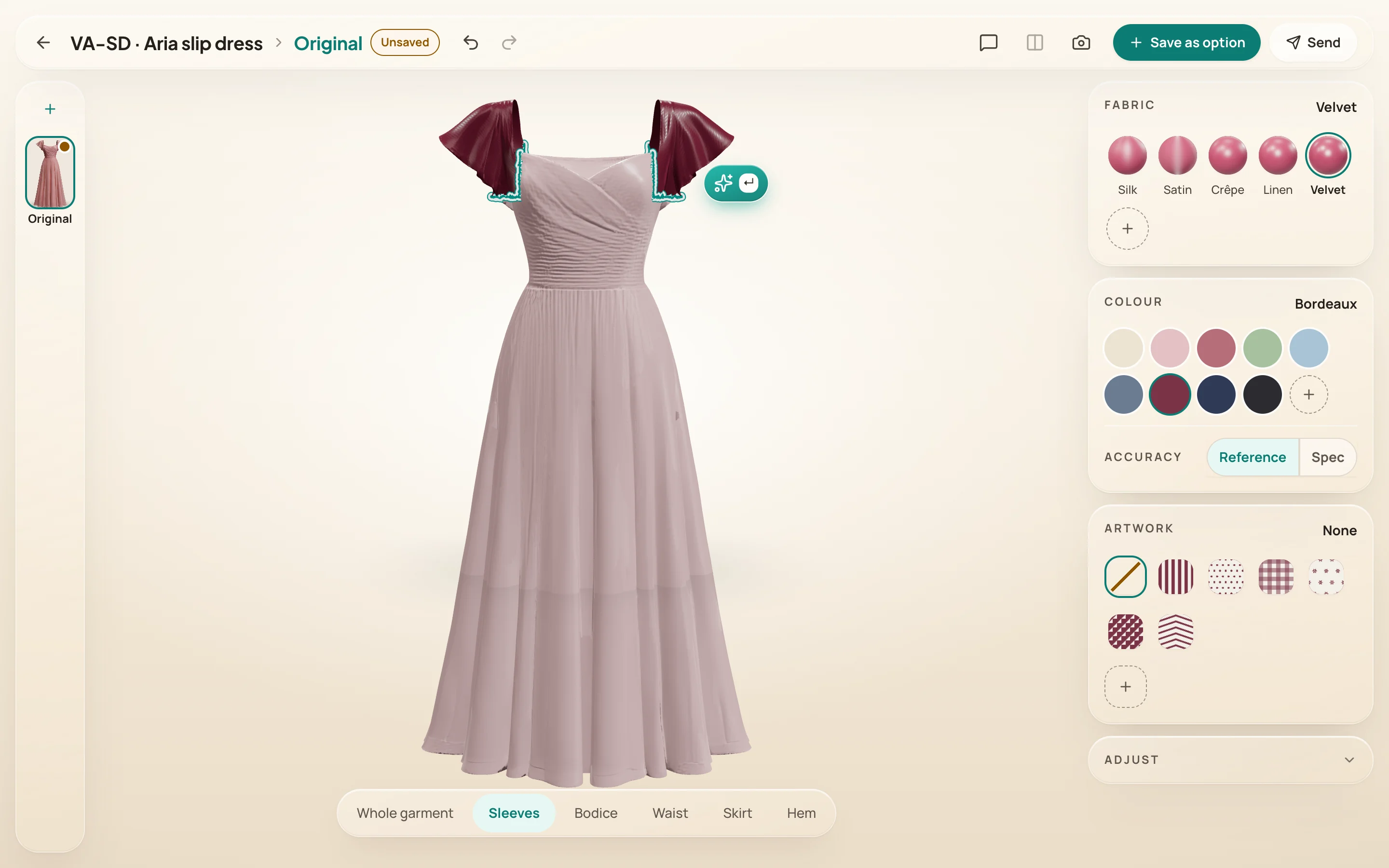
Surface shown, and named
Five spheres in her colour, each with its weave and its name.